10 Website Habits That Give Shoppers the Ick — And How to Fix Them on Shopify
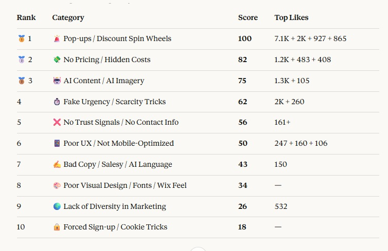
A simple question asked across social media recently produced one of the most useful pieces of consumer research you'll find anywhere: thousands of real shoppers listing, in their own words, exactly what makes them decide not to buy from a brand.
The responses were candid, specific, and occasionally brutal — and when the thread was ranked by engagement, a clear picture emerged.
Australian eCommerce merchants are making predictable, fixable mistakes that are quietly costing them sales every day. The top offenders aren't obscure technical issues. They're patterns that have become so normalised in online retail that many store owners no longer question them. Shoppers have. Here's the ranked list.
The big three — popups, hidden pricing, and AI content
Pop-ups and discount spin wheels ranked number one by a significant margin. But the specific frustrations go deeper than disliking popups generally. Shoppers described bait-and-switch sequences where entering an email for a discount triggers a second popup demanding a mobile number — and at that point, many said they'd cancel the subscription, withhold their number, and abandon the purchase entirely. Others flagged popups with deliberately hidden close buttons that make the window difficult to dismiss, and the multi-popup experience: a discount offer on arrival, an exit-intent prompt, and another popup appearing on every new page.
"Zero pricing anywhere. I'm automatically out if I don't see at least a starting price."
Number two: no pricing or hidden costs. In 2026, making a shopper contact you to get a quote is a reliable way to lose them to a competitor who doesn't. This applies equally to product pricing, shipping costs revealed only at checkout, and service-based brands who gatekeep their rates.
Number three, and growing fast: AI-generated content and AI imagery. Shoppers are increasingly fluent in recognising AI copy, AI stock imagery, and AI language patterns — and their reaction is distrust. The use of AI was cited explicitly and repeatedly across the thread. For Shopify merchants using AI tools for product descriptions or creative, this is a signal to review what's being published under your brand's name.
Trust, UX, and copy — the middle tier
Fake urgency and scarcity tricks ranked fourth. Countdown timers that reset on refresh. Stock warnings that never change. Shoppers in 2026 have seen every variation, and the response is the same: it reads as dishonest. Trust broken on a product page doesn't recover before checkout.
Fifth: no trust signals, no real contact info. A "Contact Us" page that's just a form, with no phone number, email address, or physical location, resonated widely as a red flag. For Australian merchants specifically, location transparency is becoming more important — in a world of tariffs and taxes, shoppers want to know where a business is based and ships from. A contact page with an actual address and phone number is a trust signal, not an inconvenience.
Quick Wins, Big Impact
Sixth: poor UX and mobile experience. One specific complaint generated enormous agreement — adding something to the cart and hitting back to keep shopping, only to be dumped at the top of the page instead of where you left off. This is a Shopify theme and navigation issue that's fixable and has a direct impact on add-to-cart rates. Related complaints: pages that load partially then shift layout afterward, and mobile experiences that were clearly designed on desktop first.
Seventh: salesy copy and what shoppers are now calling AI language — overuse of em dashes, buzzwords, and overly enthusiastic product descriptions that say nothing specific. The copywriting fingerprints of AI-assisted content are increasingly recognisable, and shoppers associate them with brands that don't know their own product well enough to describe it clearly.
The details that reveal a brand's character
The final three categories show that shoppers are making sophisticated judgements from small signals.
Eighth: poor visual design — too many fonts, inconsistent spacing, a design aesthetic that reads as template-built. These cues signal whether a brand has invested seriously in their presentation, and by extension whether they'll invest seriously in fulfilment and customer experience.
Ninth: lack of diversity in marketing imagery. Comments noting that a complete absence of diversity in a brand's marketing was an instant turn-off attracted significant engagement. For Australian brands serving a genuinely diverse customer base, representation in product photography is a commercial decision as much as a values one.
"Automation that signals surveillance rather than service reliably backfires."
Tenth: forced sign-up flows and cookie tricks. Being required to create an account before browsing, cookie walls that block content, and the now-notorious exit-intent popup. Also flagged: retargeting emails sent within minutes of browsing, referencing that the brand "saw you looking around" — widely described as creepy rather than helpful.
The takeaway
The pattern across all ten categories is the same: shoppers are experienced, they've seen every tactic, and they've lost patience with brands that prioritise data collection over the customer's experience. None of these icks require a full store rebuild to fix. Most are configuration changes, popup strategy decisions, or copy updates — small adjustments that compound into a meaningfully better store.
At beCommerce, we audit Shopify stores for exactly these kinds of conversion-killing patterns — the ones that have become normalised until you see them through a customer's eyes. Whether it's your popup setup, trust signals, mobile UX, or product copy, we help Australian merchants make the fixes that actually move the needle. Get in touch to find out how we work.
Is your store making any of these mistakes?
We audit Shopify stores for exactly these kinds of conversion-killing patterns — the ones that have become normalised until you see them through a customer's eyes.
Book your free audit →