Your desktop site looks fine. That's the problem
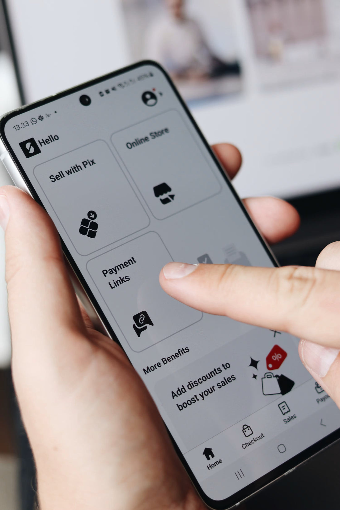
Most Shopify stores get reviewed on a 27-inch monitor and bought on a 390px phone. Here is what breaks in that gap, and how to see it for yourself.
Every review meeting you've ever held about your website happened on a big screen. Yours, your designer's, the agency's. Someone shares a browser window on a 27-inch monitor, everyone agrees the hero looks good and the new collection page is clean, and it ships.
Meanwhile mobile is running at roughly 60 percent of Australian web traffic, and AU mobile conversion sits at about half the desktop rate.
"A site can be genuinely good on desktop and quietly broken on a phone — and that gap survives for years, because the people with the authority to fix it never see the site the way a customer does."
The desktop/mobile gap, by the numbers
60%
Of Australian web traffic, mobile
~50%
AU mobile conversion rate, relative to desktop
200px+
Of the first 844px screen eaten by header, banner and cookie stack
Responsive is not the same as considered
Responsive means nothing overflows the screen and the layout reflows into one column. Every Shopify theme built in the last decade clears that bar. It is a very low bar.
Considered means somebody sat down and decided what a customer sees in the first 844 pixels of a 390 pixel wide screen, and what waits until later. Those are different jobs. Responsive is achieved by CSS written by a theme developer you'll never meet. Considered is a decision about sequence, and on most stores nobody has made it.
You can see the difference in one place. On a reflowed desktop product page the order is full-bleed hero, breadcrumb, gallery, title, star rating, long description, variant selectors, then add to cart, often past 1,400 pixels of scroll. On a considered one it's name, price and rating directly under the first image, options held back until they're needed, and a compact sticky purchase bar so the action is always reachable.
"Same theme. Same content. Different decision."
How to actually review on mobile
Chrome DevTools device toolbar is fine for checking layout and misleading for everything else. Your machine has fast wifi, a warm cache, and probably an ad blocker your customers don't have.
The method:
- Use a real phone on mobile data, not the office wifi.
- Turn off ad blockers, script blockers and any privacy extensions.
- Open a private tab so nothing is cached.
- Arrive from a Google result or one of your own ads. Never from a bookmark, because a bookmark skips the slow first load that a real customer gets.
- Sit still for five seconds without scrolling, and watch what moves.
That last step is the one everybody skips, and it's the one that reveals layout shift. If you scroll straight away you never see the button move out from under your thumb, but your customers do.
Do this at three widths: 360, 390 and 430 CSS pixels. 390 by 844 is the standard iPhone 12 through 15 viewport, 360 covers a large share of Android, and 430 is the Pro Max class of device. Things that hold together at 430 fall apart at 360 more often than you'd expect.
What breaks below 400 pixels
These are the things we see over and over, and almost none of them are visible on a monitor:
- The header stack eats the first screen. A sticky header, an announcement bar and a cookie banner can take 200 pixels or more off an 844 pixel viewport before any of your content appears. On a collection page, add a hero image and a row of filter controls and the first product sits below the fold, which is the one thing a collection page exists to avoid.
- Product cards get too narrow to carry information. A two-column grid at 360 pixels leaves each card around 160 pixels wide once you account for gutters. There's no room left for a star rating, a unit price, or enough price context to make a discount badge mean anything, so those get dropped from the mobile card. The data already exists on the product pages behind them, which makes it a layout decision rather than a content problem.
- Everything lives in the bottom right corner. The chat widget, the discount popup and the sticky add-to-cart bar are all fighting for the same 100 by 100 pixels, directly under the customer's thumb. On desktop they're spread across a wide screen and nobody notices.
- Tap targets are too small and too close. Anything under about 44 pixels, or crowded up against its neighbour, produces mis-taps that read in your analytics as erratic behaviour rather than as a broken control.
- Text is baked into images. A hero graphic with the value proposition set in type looks sharp at 1440 pixels and turns to mush at 390. It's also invisible to search engines and to any AI assistant trying to work out what you sell, so your clearest statement about your business is read by nobody.
- Long SEO copy sits above the grid. It was put there for search reasons that stopped applying a while ago, and on a phone it's a wall of text between the customer and the products.
The part that keeps it alive
None of this survives because people don't care. It survives because of who signs off.
The review happens on the device where the site looks best, run by people who know where everything is, on a connection that hides the load time. The mobile experience gets a quick glance in a device emulator at the end, usually to check nothing overflows. Which it doesn't, because the theme is responsive. Box ticked.
Then six months of ad spend runs against it and the mobile conversion number gets explained away as a mobile problem rather than a site problem.
Here's something to go and measure this week.
Take your three highest-traffic landing pages. Open each one on a real phone under the conditions above, mobile data, no blockers, private tab, arriving from a search result. Screenshot the first viewport of each, before scrolling. Put the three screenshots side by side on one page.
Then ask one question about each: can someone who has never heard of you tell what this page sells, and what to do next?
The bottom line
If the answer is no for two of the three, you've got your next quarter's work, and it isn't a redesign. It's a decision about sequence that nobody has made yet — because everybody who signs off has only ever seen the site on a big screen.
At beCommerce, we help Australian Shopify stores work out what their mobile experience actually looks like to a customer, not a device emulator, and fix the sequencing decisions that are quietly costing conversions. If you want a second pair of eyes on your mobile experience before you plan next quarter, let's talk.
Is your store making any of these mistakes?
We audit Shopify stores for exactly these kinds of conversion-killing patterns — the ones that have become normalised until you see them through a customer's eyes.
Book your free audit →